Blog
How to Make a Scatter Plot in Excel: See the Story Behind Your Data
 Sik Yang · Mar 1, 2026
A scatter plot is the right chart when you want to understand the relationship between two numeric variables. Each point has an X value and a Y value, which makes patterns, clusters, and outliers visible.
Unlike a line chart, a scatter plot does not assume that points belong in a time sequence.
Scatter Plot vs Line Chart
Use a scatter plot when asking whether more of X is related to more of Y, such as ad spend vs revenue. Use a line chart when showing change over time, such as monthly sales.
A scatter chart treats both axes as numeric scales. A line chart often treats the horizontal axis as categories.
Prepare X and Y Data
Put the independent variable in the left column and the dependent variable in the right column. Use headers in the first row and numeric values below.
Insert the Scatter Chart
Select the data range, then go to Insert > Scatter and choose the option with markers only.
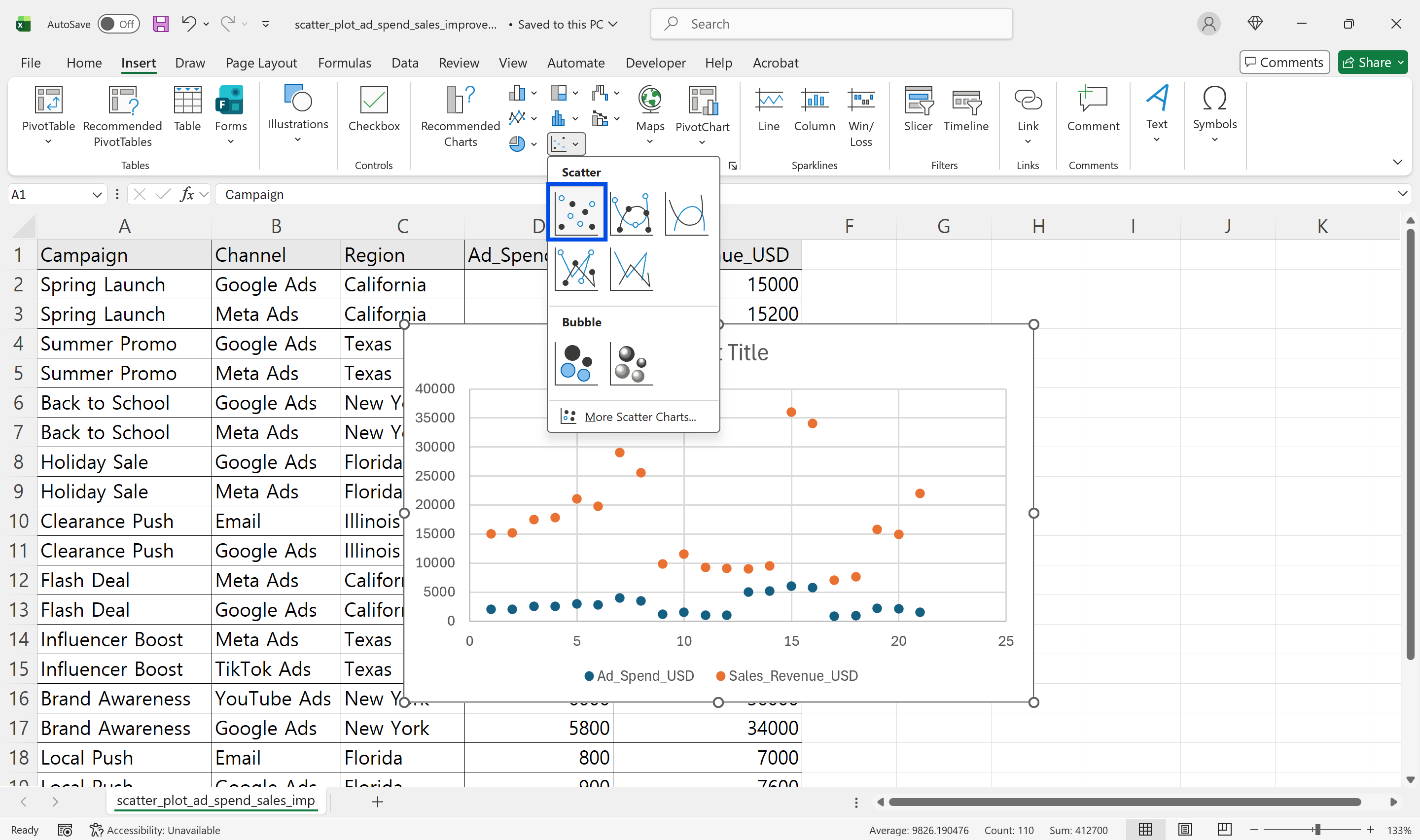
Markers without connecting lines are usually best for correlation analysis because connecting lines can imply a sequence that does not exist.
Check Axis Assignment
Excel usually uses the first selected column as X and the second as Y. If the axes are reversed, right-click the chart, choose Select Data, edit the series, and swap the X values and Y values.
If points are missing, check for text-formatted numbers, blanks, and error values.
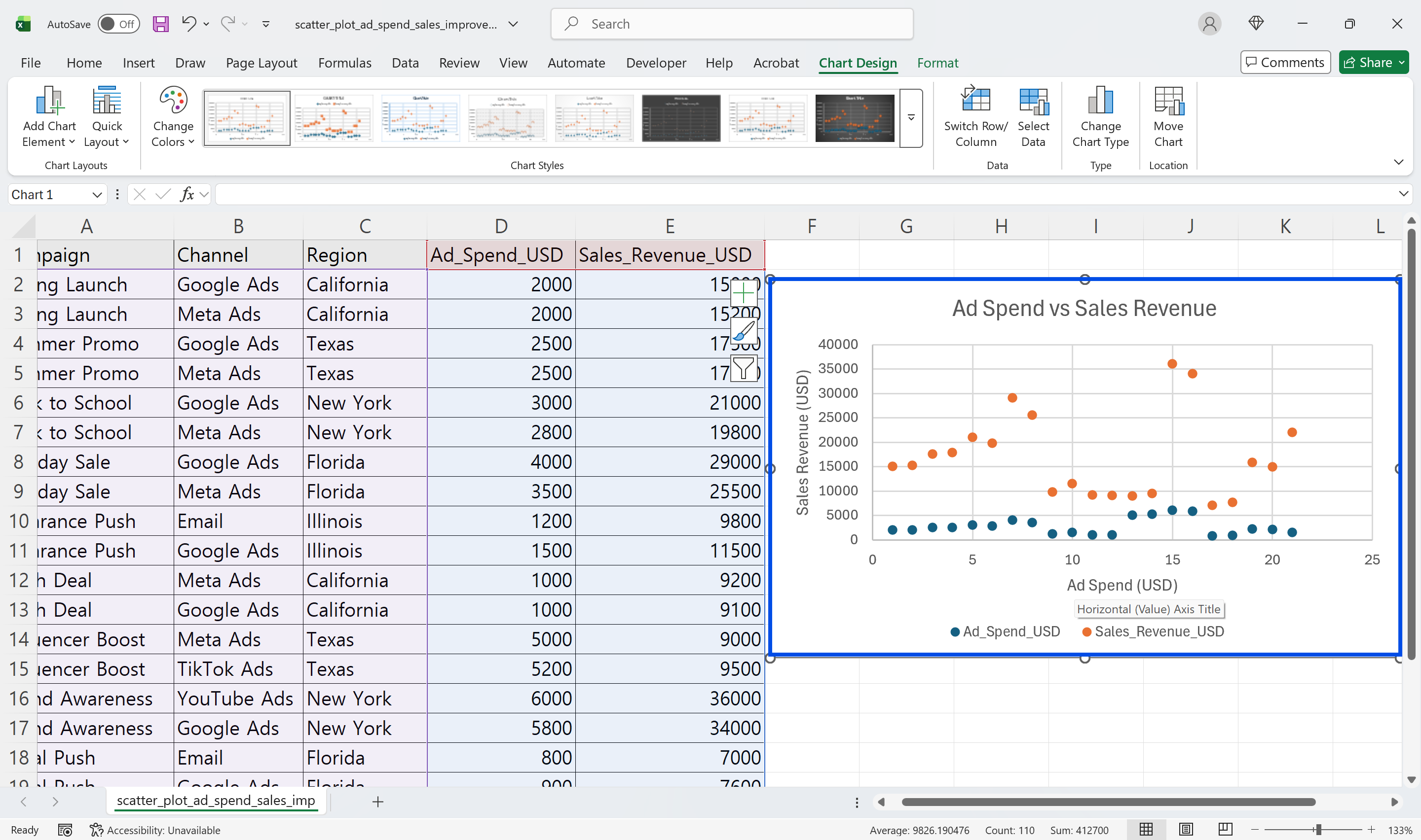
Add Titles and Axis Labels
Add a chart title and axis titles. Include units, such as Ad Spend in USD and Revenue in USD. Adjust axis minimum, maximum, and interval values when the points look too compressed or too spread out.
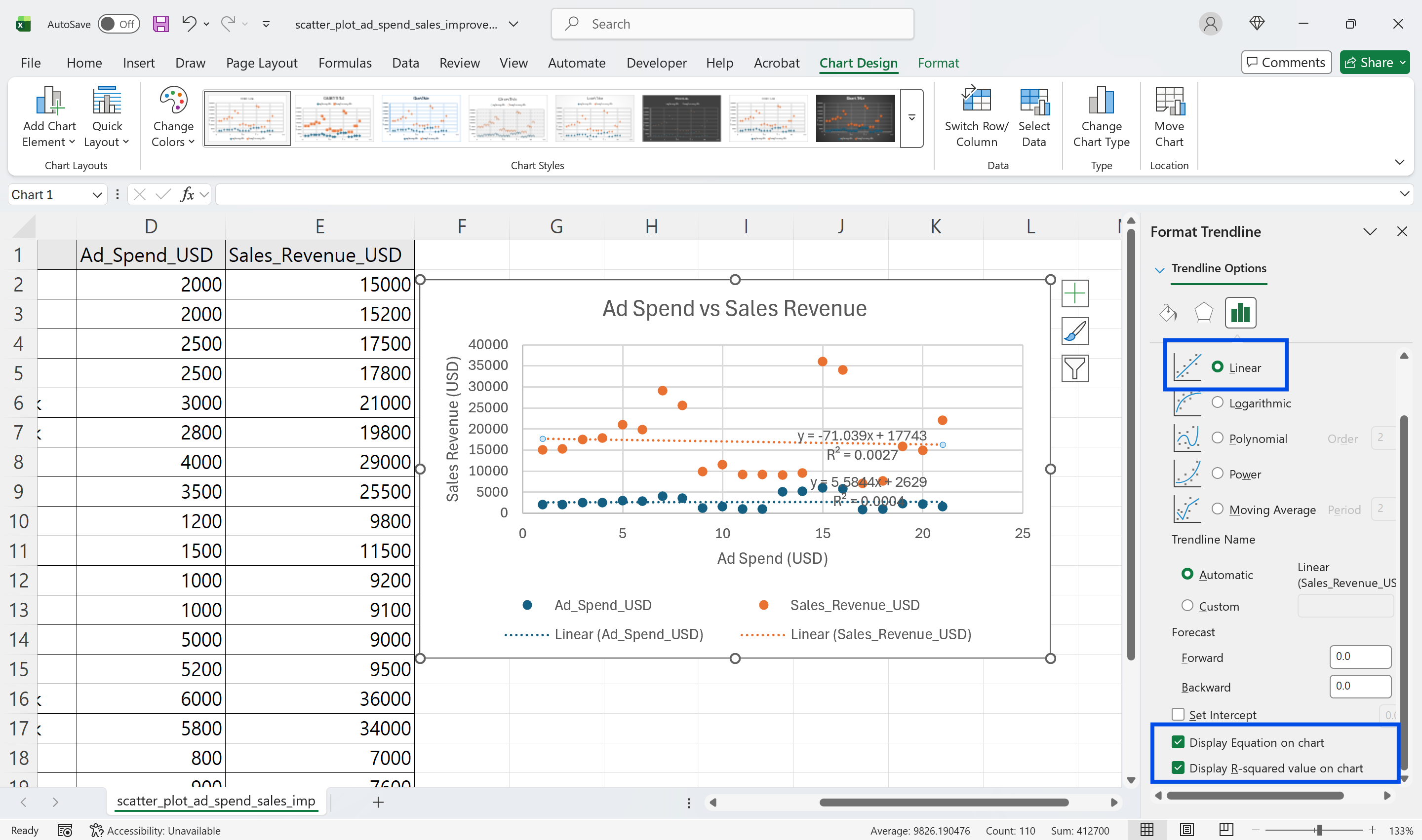
Add a Trendline Carefully
A trendline can summarize the pattern. Use a linear trendline for simple straight-line relationships. Use other trendline types only when the data shape justifies them.
R-squared explains how much of the variation is captured by the trendline, but a high value does not prove causation. Always validate the relationship with business context.
Practical Visualization Tips
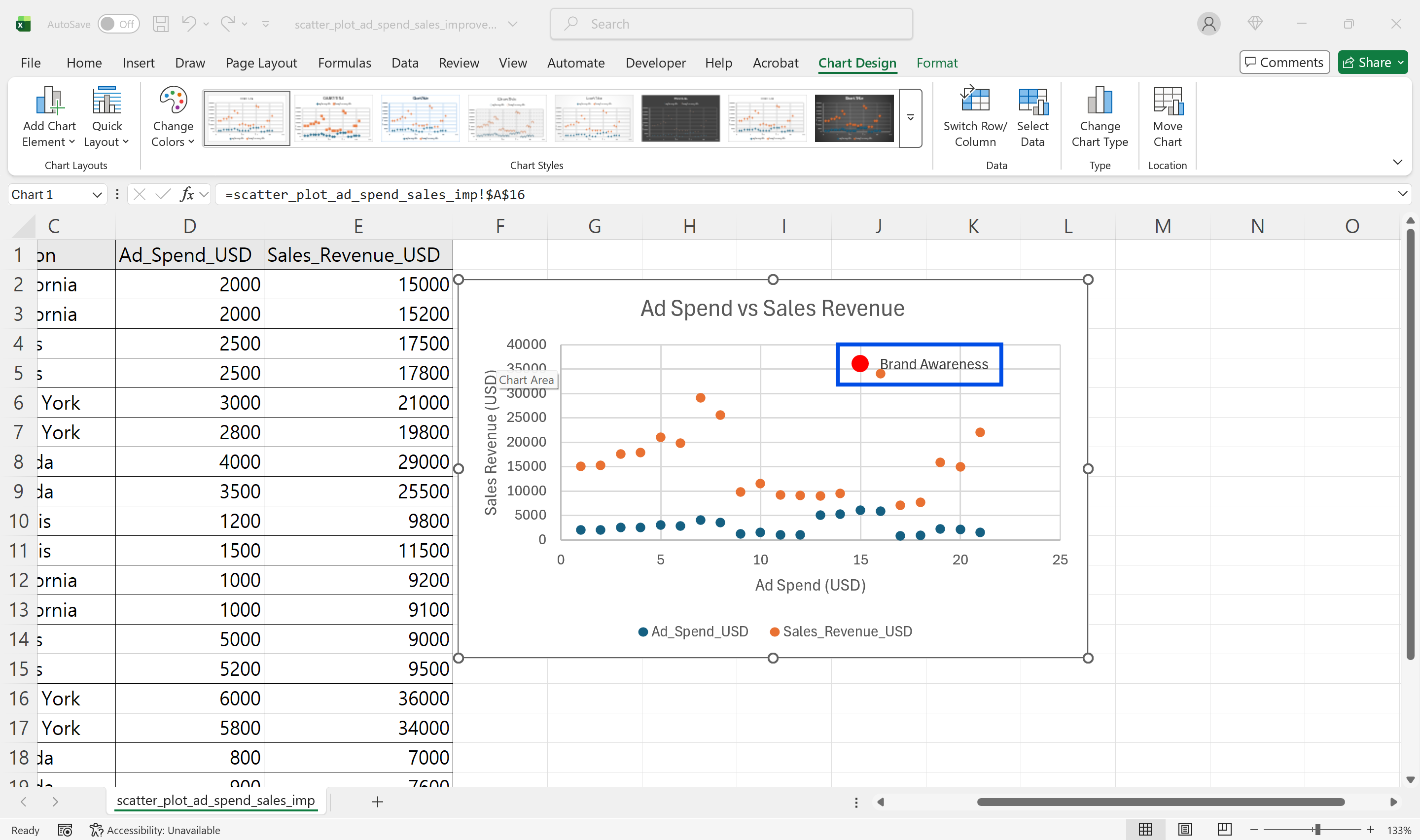
Highlight outliers as a separate series, use different colors for different groups, and avoid showing thousands of points at once. Use filters or slicers to help users narrow the view.
Make Excel Scatter Plot Analysis Easier with inline AI
Once you know how to create a scatter plot in Excel, the next step is automating repeated analysis work. Wouldn't it be easier to stop manually adjusting axis ranges and checking X/Y column placement every time?
inline AI is a local agent that works directly inside Excel. Ask in natural language, such as create a scatter plot from these X and Y columns, and it can read and edit your Excel file in real time.
Because it runs locally on your PC without uploading your data to the cloud, it can handle sensitive spreadsheets more safely. Download it today and experience the future of Excel work yourself.
Download your AI Coworker for Excel