Blog
How to Make a Graph in Excel: Complete Guide to Chart Types and Updates
 Sik Yang · Mar 1, 2026
Graphs turn spreadsheet data into something people can understand quickly. The challenge is that a chart is only as good as the data range, chart type, and axis settings behind it.
This guide covers the basic workflow and the mistakes that cause charts to mislead or stop updating.
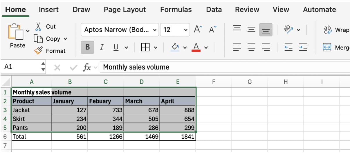
Step 1: Prepare the Data
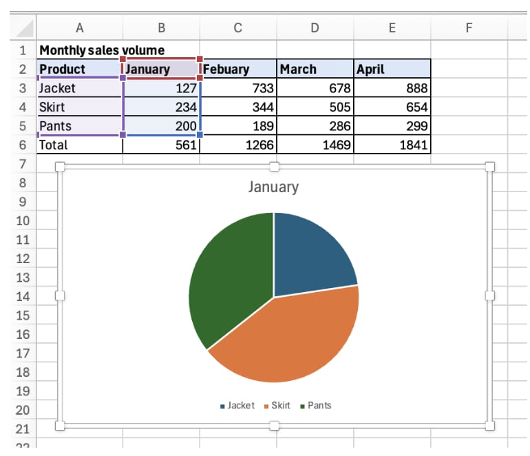
Put headers in the first row and numeric values below. Use the first column for dates, categories, or labels. Remove blank rows and make sure numbers are stored as numbers, not text.
Step 2: Select the Data
Select the range you want to visualize. Include headers, but usually exclude total rows because totals can distort the chart.
Step 3: Insert a Chart
Go to Insert and choose the chart type. The most common types are bar charts, line graphs, and pie charts.
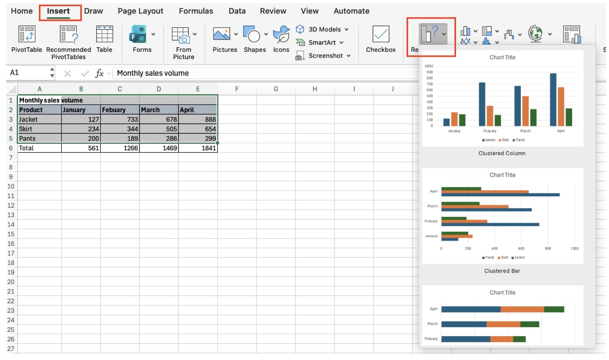
Bar Charts
Bar charts compare categories. Use them for product sales, department performance, or regional totals.
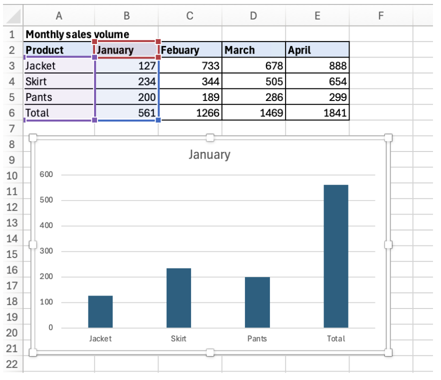
Add axis titles and data labels when the numbers need to be read precisely.
Line Graphs
Line graphs show change over time. Use them for monthly sales, traffic trends, and performance tracking.
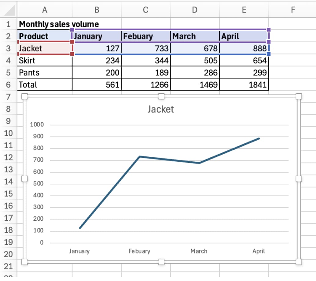
Make sure the date or period column is on the horizontal axis.
Pie Charts
Pie charts show parts of a whole. Use them for market share or budget mix, but keep the number of categories small. More than five slices usually becomes hard to read.
Why Charts Stop Updating
A chart references the range selected when it was created. If new rows are added outside that range, the chart may not update.
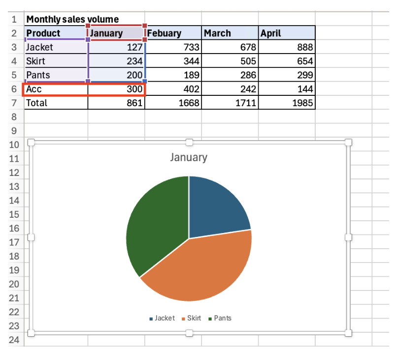
To fix this, adjust Select Data or convert the source range into an Excel Table so the chart range expands automatically.
Axis and Label Standards
Always check axis scale, units, title, and labels. A misleading axis can exaggerate or hide differences. A good business chart communicates one message clearly without unnecessary decoration.
Automate Excel Chart Work with inline AI
Once you know how to make a graph in Excel, the next step is automating repeated chart setup. Wouldn't it be easier to choose the right chart type, set labels, and refresh visuals without rebuilding the same report every time?
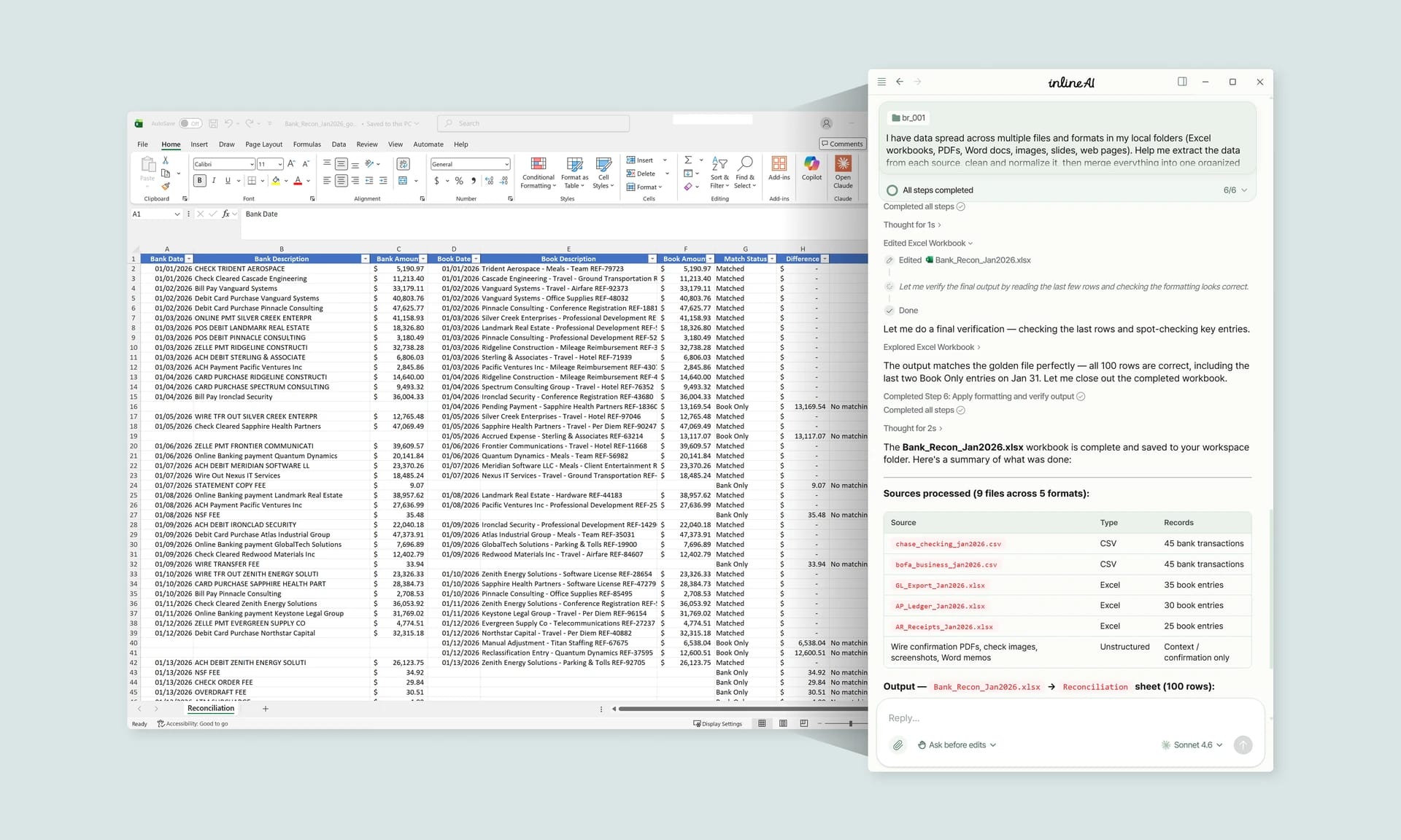
inline AI is a local agent that works directly inside Excel. Ask in natural language, such as create a chart that compares monthly revenue by product, and it can read and edit your Excel file in real time.
Because it runs locally on your PC without uploading your data to the cloud, it can handle sensitive spreadsheets more safely. Download it today and experience the future of Excel work yourself.
Download your AI Coworker for Excel